

Data for the Win!
Even before I was born, my family has been huge followers of Bay Area sports. Our Golden State Warriors are currently up 1-0 in the Western Conference Finals. (Go Warriors!) As a fan, it’s a lot of fun (and nerve-wracking) to watch our favorite teams do what they do. As an evaluator, my brain can’t help but also see the fun in the numbers of the game, the different stats and data visualizations flashed on the screen or written in articles.
In between games, we’re reading, watching, or listening to anything and everything about our teams. There’s so much more to the game than just the final score. How many points did each player score? What was their 3-point shooting percentage? How many turnovers did they give up? What is their win-loss record with and without my sister’s favorite, Klay Thompson, playing in the season?
Tons and tons of data points are collected at each game, for analysts and fans in general to oooh and ahhh, slice and dice, compare and contrast, plan for the next game, and just get to know our favorite players a little bit more. In this article, I invite you to “nerd out” with me, not because we’re basketball fans, but because we’re evaluation fans!
Here are some stats and a data visualization from a little while ago that makes a very, let’s say fascinating, interpretation of the data:
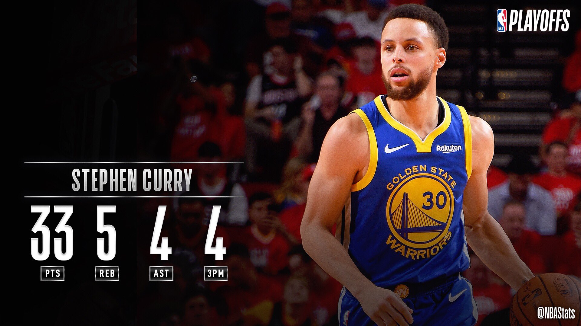
Steph Curry ERUPTS for 33 2nd half PTS as the @warriors advance!
— NBA.com/Stats (@nbastats) May 11, 2019
GSW has a postseason record of 29-4 when Steph scores 30+ PTS. This 87.9% win % is the highest in @NBAHistory among the 30 players with at least 20 career 30-point games in the playoffs. #SAPStatLineOfTheNight pic.twitter.com/A3SexZJiIX
This data viz is telling us that it’s it is important (they use the word, “Erupts” in all caps for emphasis) that Steph Curry got 33 points (that’s what the PTS means) and that he did it all in the 2nd half (even if you didn’t know there were two halves in basketball, it still emphasizes that this was accomplished in a shorter time). It also gives a, “so what” interpretation by stating that the Warriors advance (again, even if you didn’t know that they get to go onto the next round of the playoffs, “advance” can be interpreted as a good thing in most contexts).
It comes with an in-game image and some additional data points about his performance. The analyst could also have included how many steals, fouls, minutes, free throws, or even how many shots he took on one leg (kidding about this one, but also not really because I bet they actually have data on this!)
Out of all the different data points they could calculate and the various comparisons they could make, they chose a handful to highlight in one post. In our evaluation work, we have a similar task. We are swimming in data points from public opinion surveys, focus groups, key informant interviews, policy record reviews, media activity records, observations, and other important engagement and data collection efforts.
There are many ways to summarize and analyze different data, just like they did with the above post. Sometimes you bring together different sources. Sometimes data are only used internally. As always, be sure to define the intended audience and purpose. In the example, I can just imagine their statisticians looking at all kinds of data trying to make sense of what their audience would want to know about. I think it’s to get fans excited about the greatness of a fan favorite player and show how his individual performance contributes to the team’s success.
As a sports fan, I can’t get enough content about my teams, because I want to know as much as I can about them. As an evaluator, I appreciate all the hard work and care that goes into summarizing it all. Our internal and external evaluators have a similarly challenging job with evaluation data. I also recognize the efforts of the data collectors carefully counting all the important statistics. That’s why we want to make sure we invest in our evaluation data collectors by ensuring they are well trained and engaged throughout the data evaluation project.
At the end of the day, we need to put evaluation data to use. Why go through all that if we don’t make it useful! We need to make sure we break it up into manageable chunks. In the example above, some of those other data points not shown are included in a separate article or discussed in an interview. A lot of it is just kept internally. For example, the coaching staff might look at similar data points from other teams to come up with a game plan for how to compete against them. Other data points might not make much sense until they get a few more waves (additional time points) of data to see how things may change over time. That sounds just like our evaluation data, doesn’t it? Let’s put our data to use and gain some evaluation fans along the way.
Even when your team isn’t winning, there’s always lots to learn. Fortunately for Warriors fans and data fans alike, our team will post even more exciting data as they keep going strong in these playoffs.
If you’re interested in making engaging materials like these, our friends at the Tobacco Education Clearinghouse of California can provide examples and technical assistance. You can also check out our website for resources on data visualizations for turning your data into compelling visuals.