
Data Viz Basics
Why Do We Visualize Data?
One of the areas TCEC receives the most questions about is data visualization:
"Is a bar chart or a pie chart better?"
"How many graphs am I required to include in a report?"
"We collected a lot of data, how do I know which I should make into a chart?"
During our recent experiment with providing a FER/BER review service, the TCEC team discovered that a majority of the reports we reviewed struggled with including impactful data viz.
It's not hard to see why folks might be confused. The Tell Your Story scoring rubric includes this measure as part of the Implementation and Results section:
Represents results effectively, using data visualization principles where appropriate. Interpretation of data is provided.
But what does this actually mean? What does it mean to represent results effectively and provide interpretation of the data?
TCEC is currently developing some exciting new resources to help our tobacco prevention partners create more effective data visualizations, but before we can dive into chart types and style guides, we need to take a step back.
Why do we visualize data in the first place?
Often, when we see confusing or poorly designed data viz, it's for one (or both!) of these reasons:
- The report authors aren't sure what the message of the visualization is.
- The report authors are including charts because they believe they need to have something in chart format, even if the data isn't relevant.
Ultimately, the purpose of data viz is to make data easier to understand. So if you don't know why you're making data into a chart, your audience won't know either!
As Dr. Stephanie Evergreen puts it, "The most important question in data visualization is: What's your point?"
Before you insert a chart, do this!
As part of TCEC's new Final Evaluation Report Pre-Writing Workbook, we included a quick exercise you can do when thinking about which data you want to present as a visual:
- Which data do you want to share as a visualization?
- Why is this data important enough to visualize? (If you can’t think of a reason, don’t make the data into a visualization!)
- What is the main takeaway from this data viz? Write it as a sentence.
For example, if your project is pursuing a smoke-free MUH objective, you may decide that having an effective data visualization about smoking rates in multi-unit housing is important.
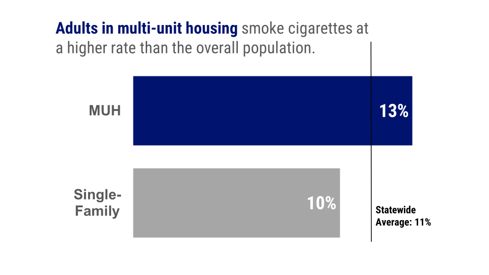
(If you're curious how we made this chart, you can watch our step-by-step in this webinar!)
Interpreting the data
Another key part of effective data viz is providing context and interpretation in your report's narrative. In simple terms, this means: Tell us what we're looking at, and why it matters! This is why it's crucial to determine your message before creating charts. If your data was crucial to your campaign's success, tell us how!
In the example above, we wouldn't simply include this chart in a report without explanation. We'd say something like:
"The adult smoking rate in multi-unit housing in our jurisdiction is higher than the overall statewide population (Figure 1). This data contributed significantly to the program's decision to pursue an MUH objective during this funding cycle..."
Whatever data you choose to present visually, be sure to weave your explanation of it into the report narrative.
Stay tuned for more!
The TCEC team will be releasing new resources about data visualization soon, as well as some upcoming webinars. In the meantime, what else would you like to learn about data viz or reporting results? Drop us a line and let us know!